Keel / In use · twelve sites · 2019 — 2025
Where it has been.
Everything below was set by someone else. We list it because a typeface is only as good as the worst place it has ended up.
01Signage
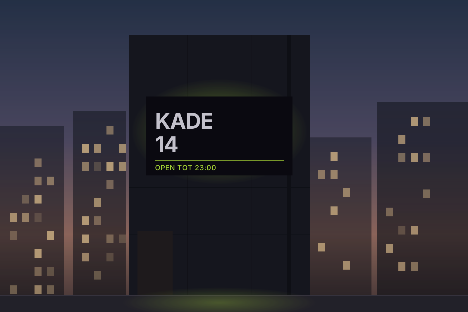
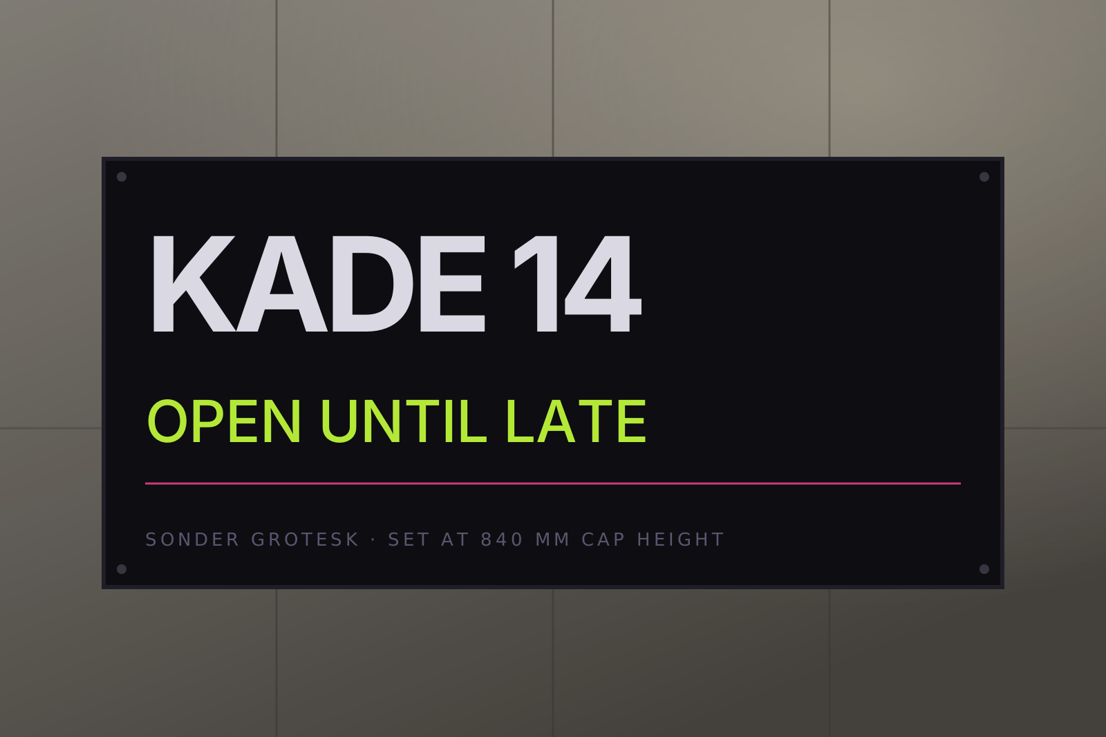
Kade 14, Rotterdam
A harbour building with a wall nobody could read from the water. Set at 840 mm cap height, white on a painted steel plate.
| Client | Kade 14 / Municipal Harbour Trust |
| Year | 2023 |
| Cut | Black 900, normal width |
| Set at | 840 mm cap height |
| Fabricator | Van Doorn Staal |
02Editorial
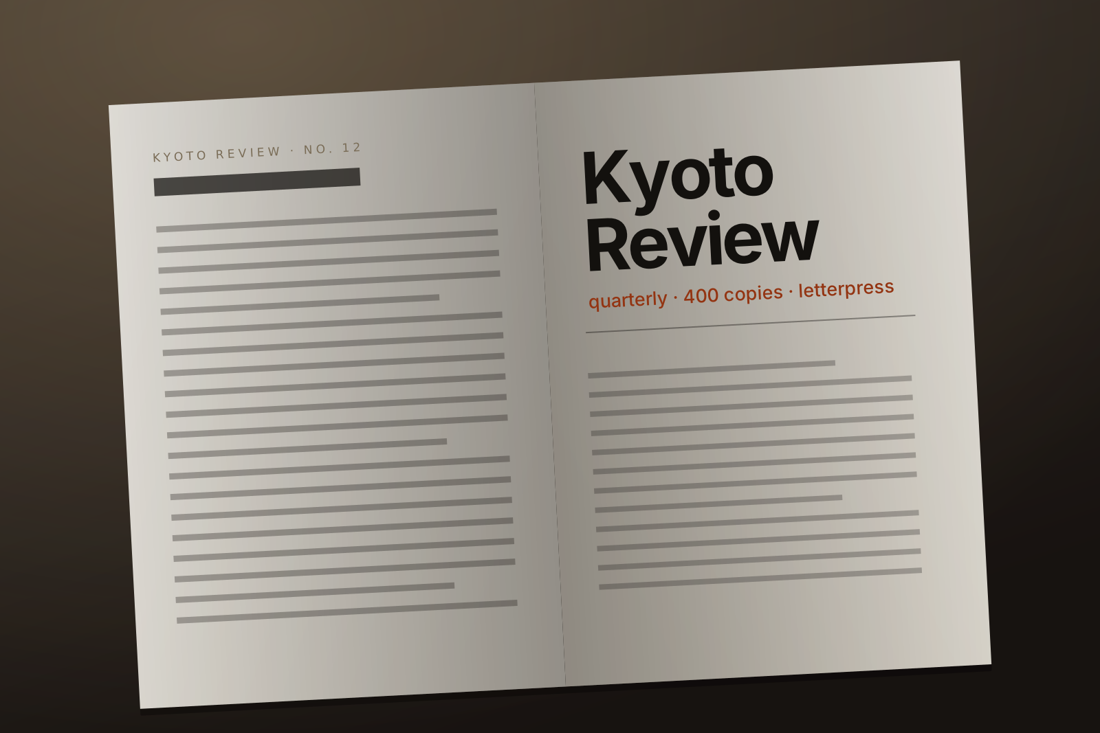
Kyoto Review, quarterly
A small journal that prints 400 copies and cares about exactly two things: the paper and the line length.
| Client | Kyoto Review |
| Year | 2024 — present |
| Cut | Light 200 / Regular 400 / Italic |
| Set at | 9.5 / 14 pt |
| Printer | Ōtsuka, letterpress |
03Screen
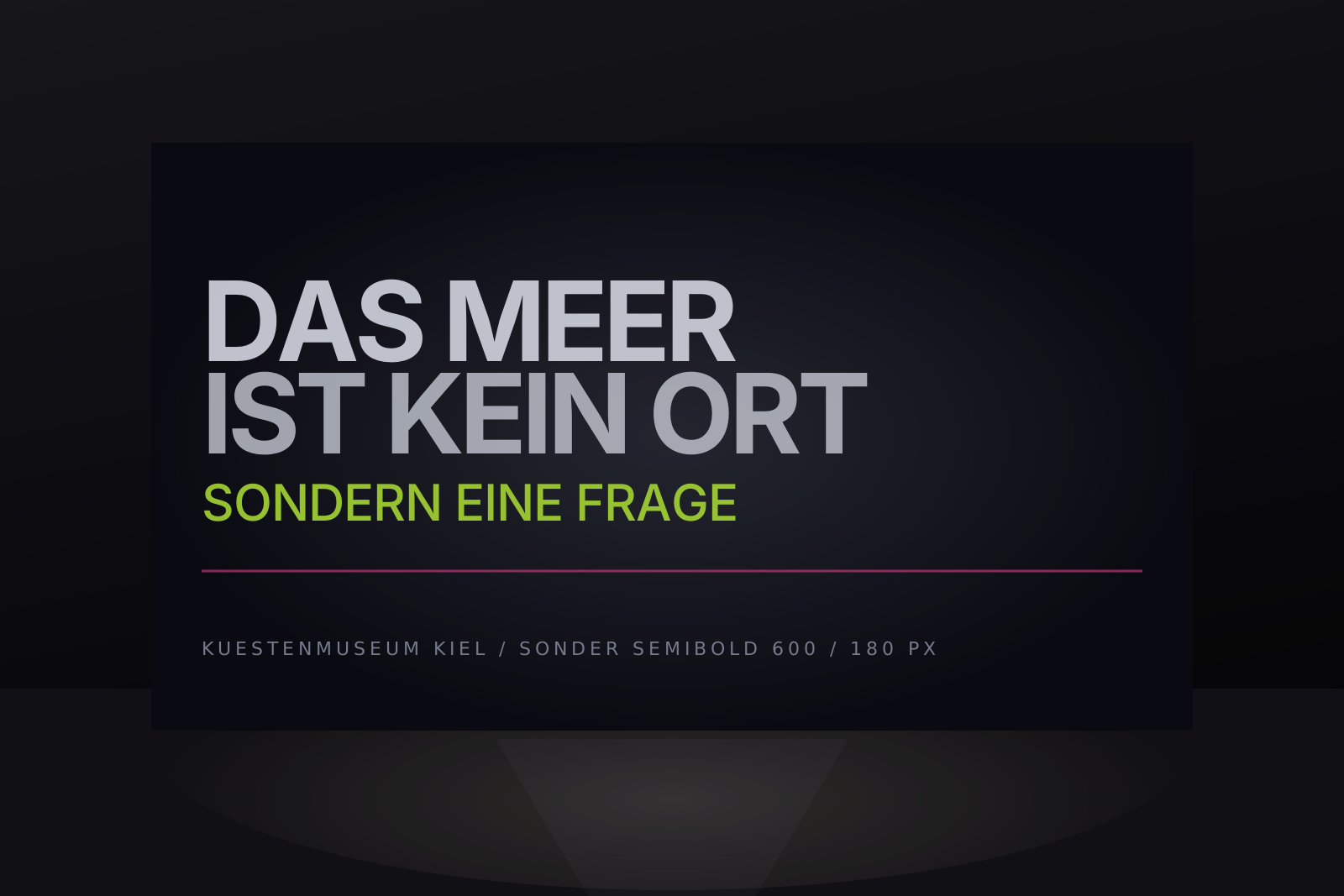
Küstenmuseum, Kiel
Nine metres of projection at two metres' viewing distance, running unattended for ten years.
| Client | Küstenmuseum |
| Year | 2022 |
| Cut | Semibold 600 |
| Set at | 180 px, 2 m viewing |
| Runtime | 10 years, unattended |
04Also set in Sonder Grotesk
- 05Harbour Trust annual report, 2023 — Black 900 and Regular 400, 148 pages
- 06Signage for a cycle path along the Maas — Condensed Medium, 240 mm
- 07A bookshop in Ghent that has used the same weight for eleven years
- 08Two album sleeves, both of which used the italic badly
- 09A ferry timetable that had to work at arm's length in the rain
Also set in Sonder Grotesk
Setting something with it?
We keep a list. Send a photograph and we will add it — good or bad, we do not curate the bad ones out.
type@cureyaa.com