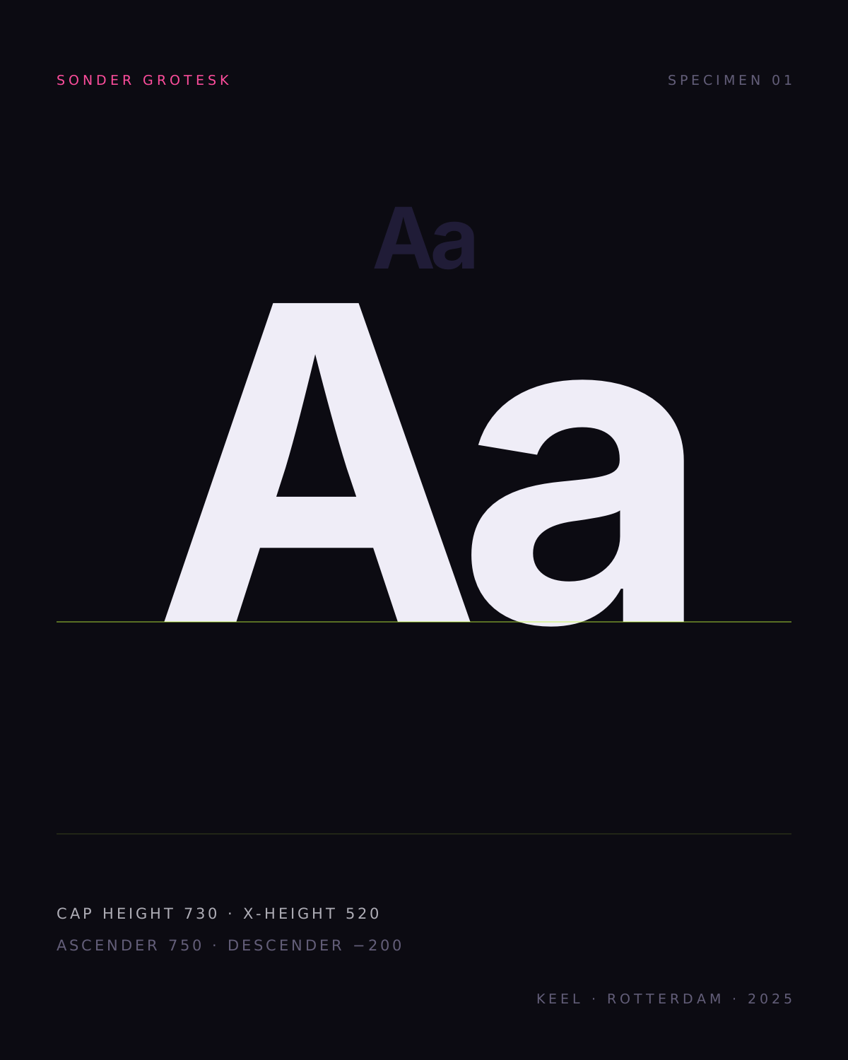
Sonder Grotesk · four weights, two widths · 2025
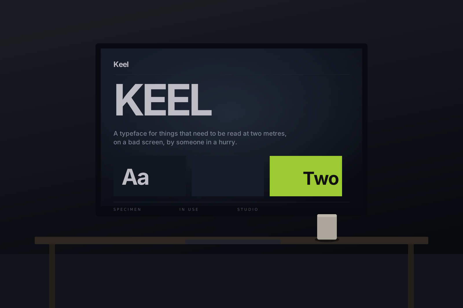
A typeface for things that need to be read at two metres, on a bad screen, by someone in a hurry. Drawn over six years; released with the drawings.
hover the letters · drag the sliders below
- Note Sonder Grotesk 1.4 released 12 March 2025 — the condensed cut now carries the full Latin Extended set, and the italic has a real f. Customers from 1.0 get it free. Read the changelog
01In use
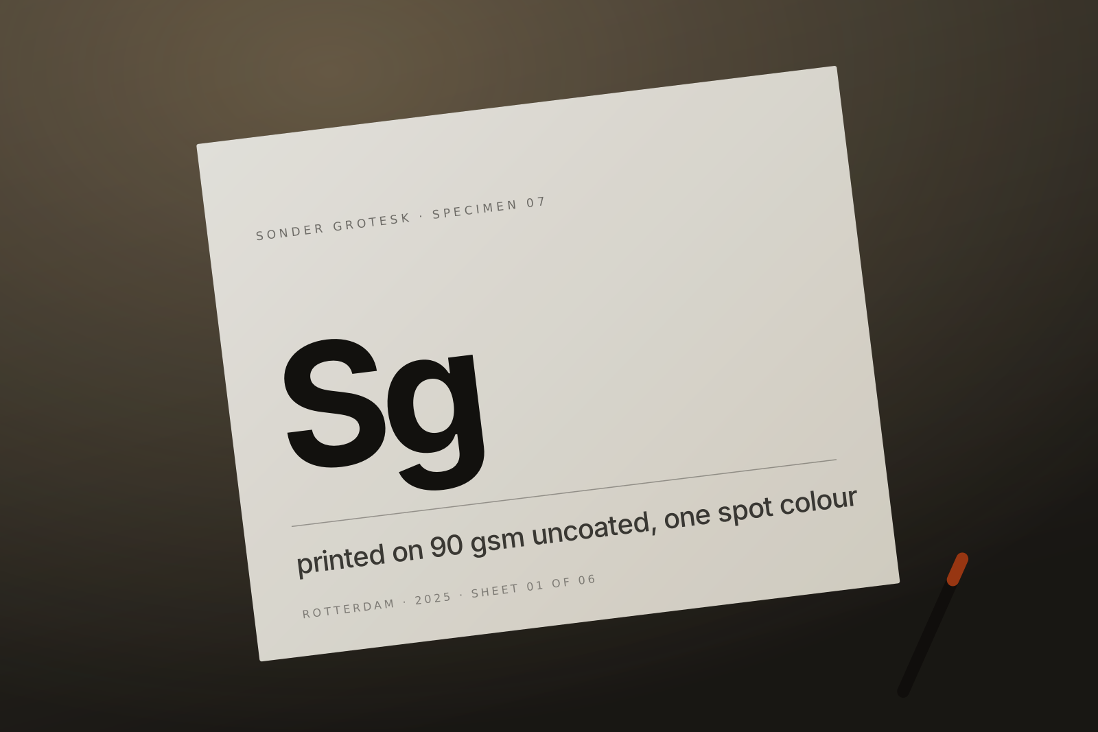
All twelve sites →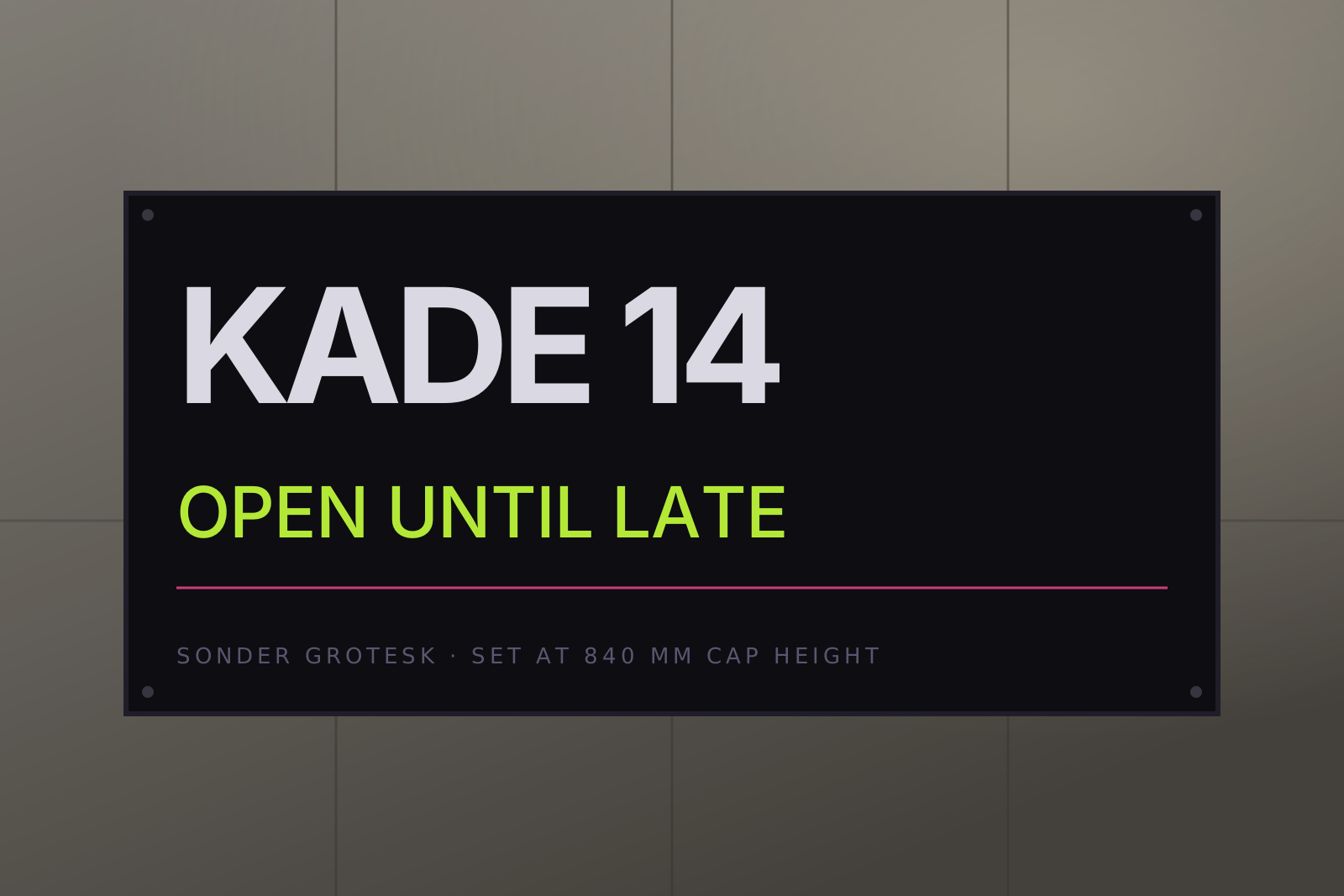
02The cuts
Full specimen →Hamburgefonstiv
For captions and long notes. Almost too thin below 12 px — do not use it on a projector.
Hamburgefonstiv
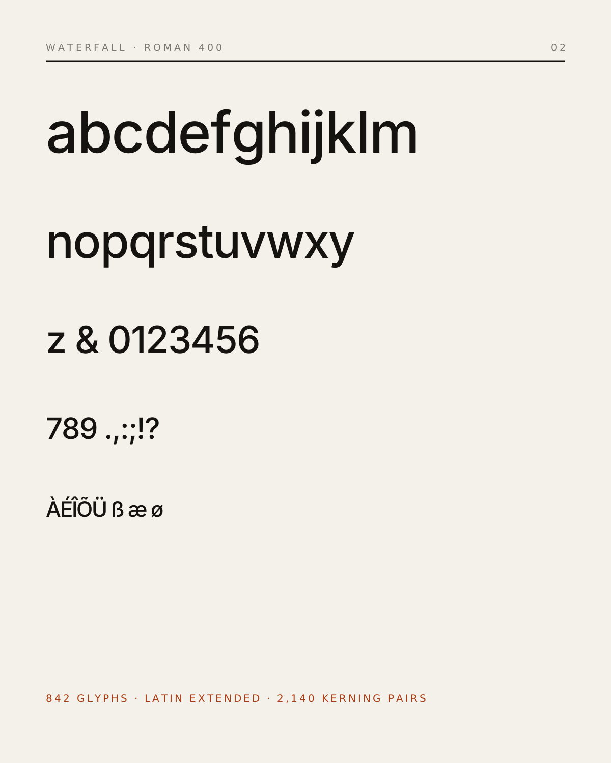
The workhorse. Ninety per cent of everything we have ever set with this family is this one weight.
Hamburgefonstiv
Headlines on screens, where the contrast between thick and thin keeps collapsing.
Hamburgefonstiv
Posters only. At small sizes the counters close and it becomes a texture, which is sometimes what you want.
Hamburgefonstiv
Not a slanted cut — redrawn. The a loses its tail and the f grows a descender, as it should.
Hamburgefonstiv
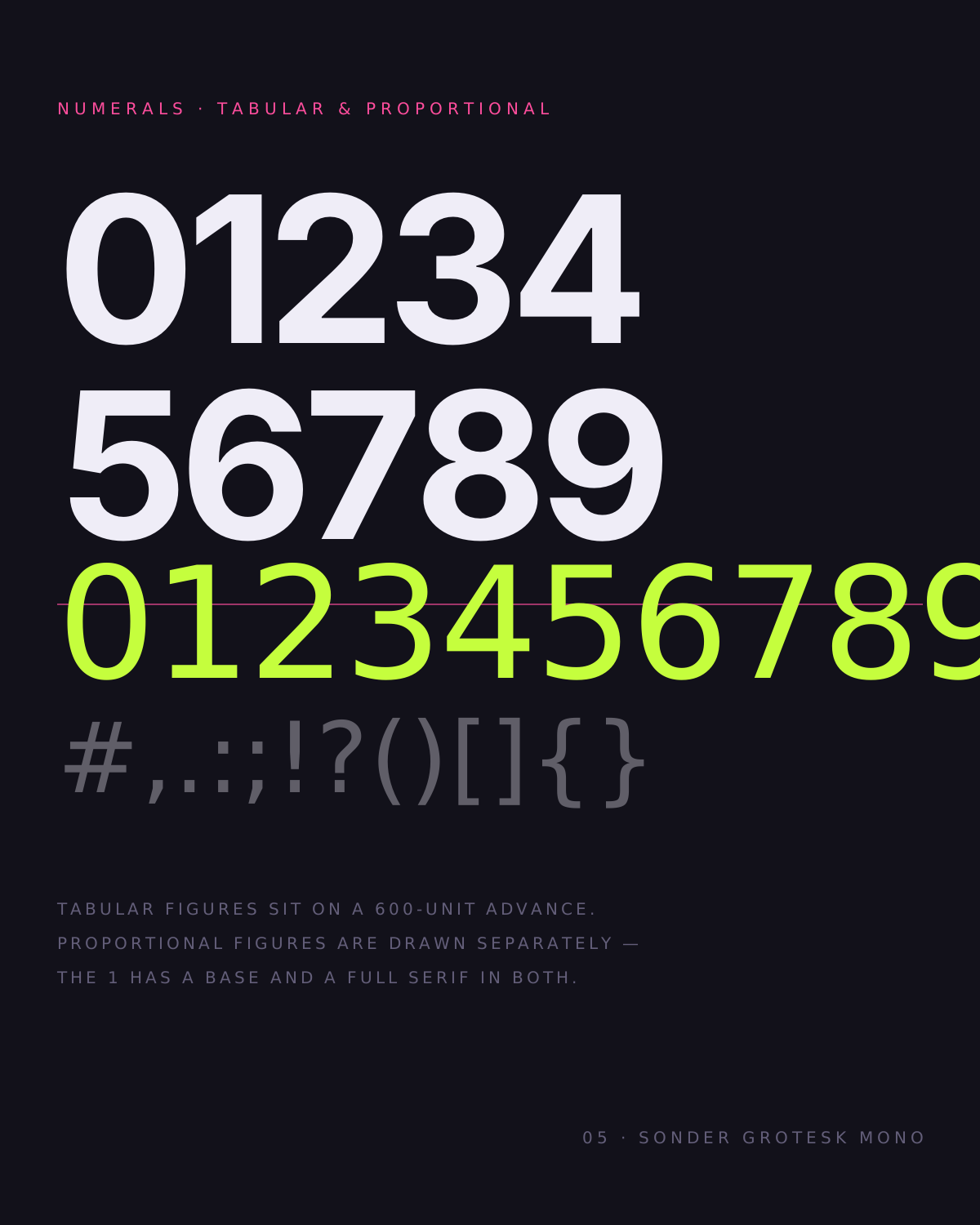
Companion monospace. Zero is slashed, one has a base, and every glyph is exactly 600 units wide.
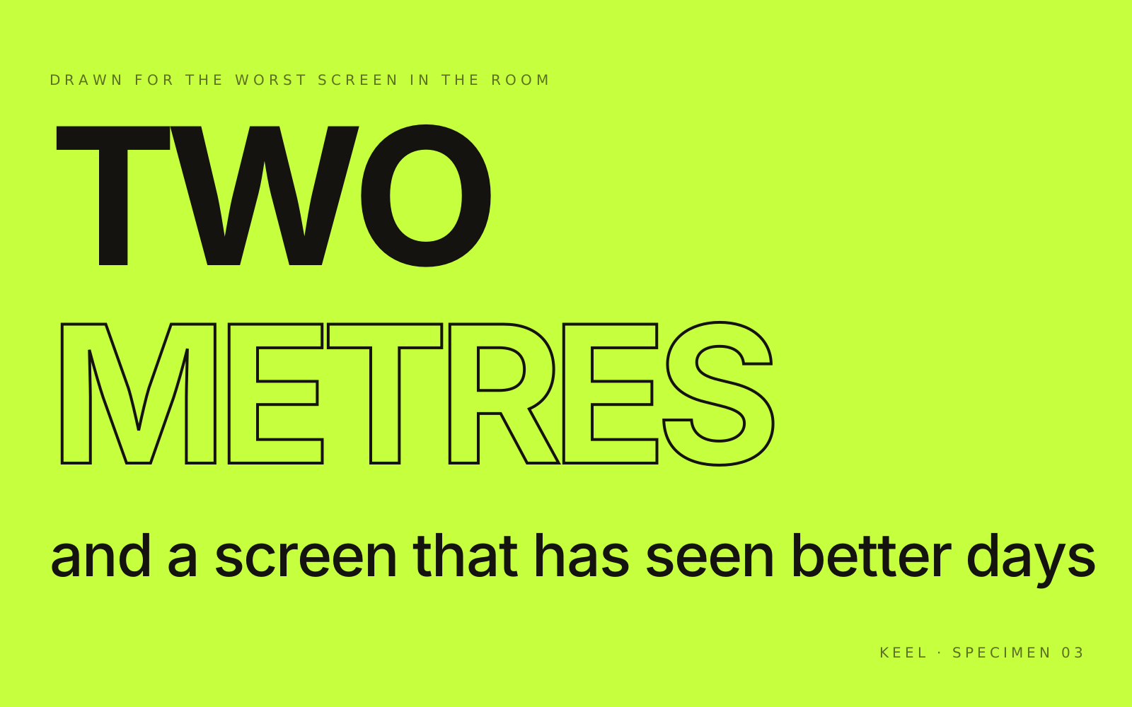
Drawn for the worst screen in the room.
We started this because a client had a sign that nobody could read — a wall-mounted screen, late afternoon sun behind the glass, one line of text that mattered. Every existing grotesk failed at that distance. So we drew one that did not, and then kept going for six years.
The family is not variable. That was a deliberate choice: four weights, two widths, drawn individually rather than interpolated. It costs us a longer production cycle and it is why the black weight has a spine instead of a mush of overlapping curves.
Licensing is per-size, not per-view. A small studio pays what a small studio can pay; a broadcaster pays more. Both get the same files and the same drawings.
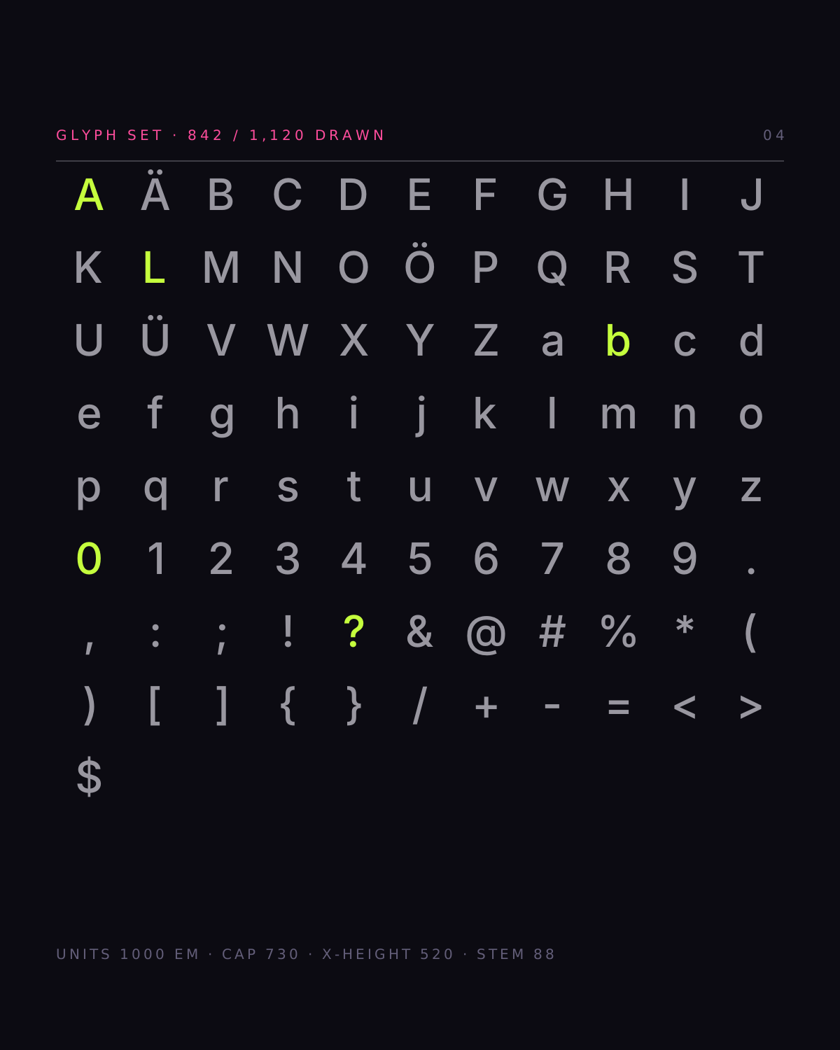
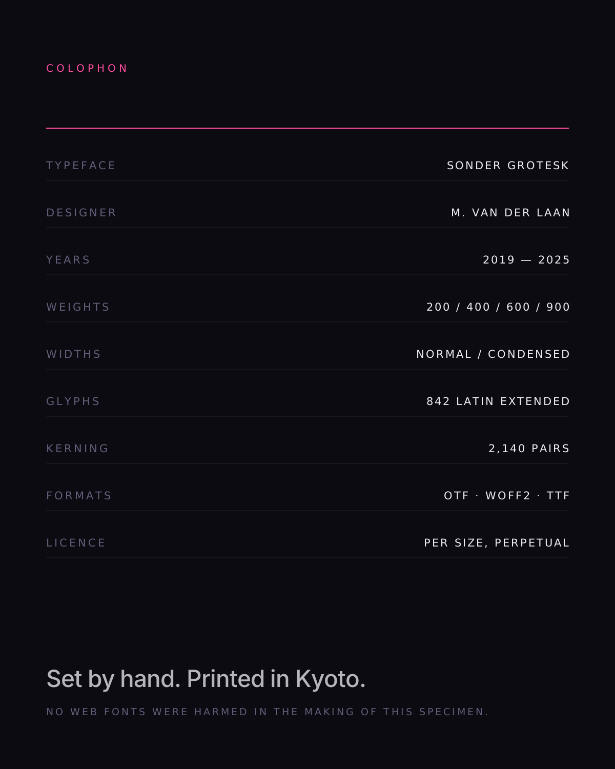
| Glyphs | 842 / Latin Extended |
| Weights | 4 + 2 widths |
| Italics | Redrawn, not slanted |
| Formats | OTF · WOFF2 · VAR |
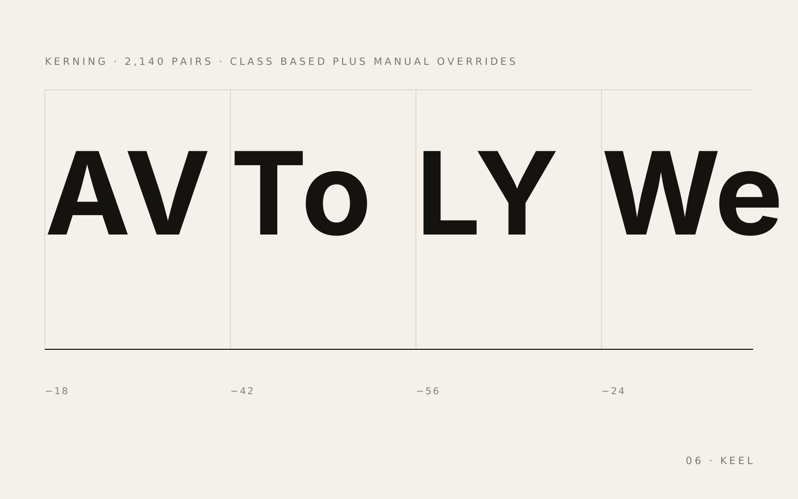
| Kerning | 2,140 pairs |
| Year | 2025 |
Available for commission
Try it on the thing that actually needs it.
Trial files are free for anything you can hold in your hand. Tell us the size and the substrate; we send the weight you need, not the whole family.
type@cureyaa.com